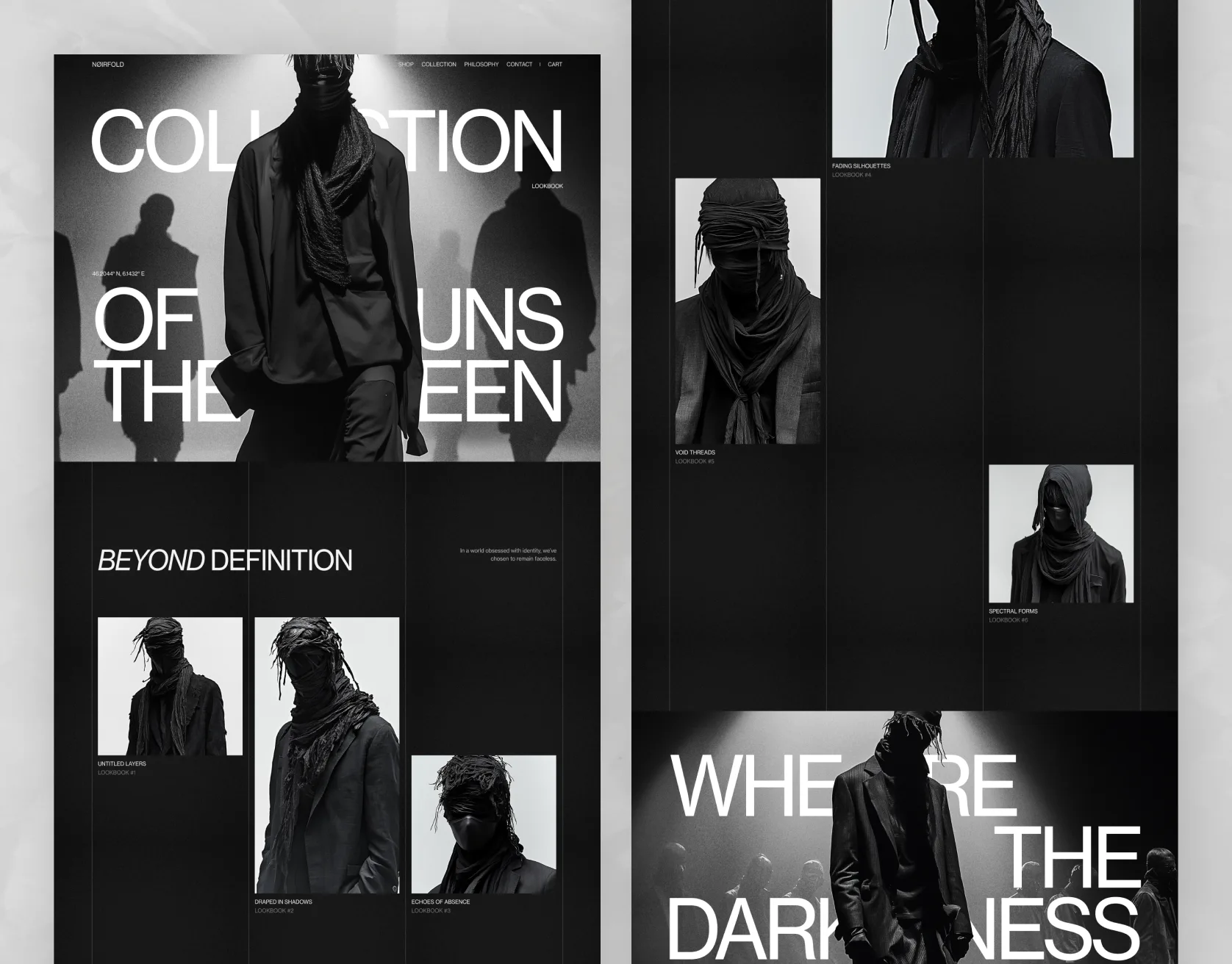
01 — OverviewNoirfold / website
The brief
Noirfold had a collection people actually wanted and a site that made them work for it. The lookbook sat three clicks deep, the thinking behind the collection was nowhere on the page, and the whole thing read as a catalogue rather than a position.
What we did
We rebuilt the site around the collection story instead of the product grid. Editorial-scale type, full-bleed imagery and one uninterrupted path from the campaign film to the piece in the cart — so the brand does the arguing before the product page has to.
The shift
Story first, grid second
Every screen argues for the collection before it asks for the sale.
Deliverables
- 01Positioning & site strategy
- 02Information architecture
- 03Full UI design system
- 04Motion specification
- 05Front-end build & handover