design agency
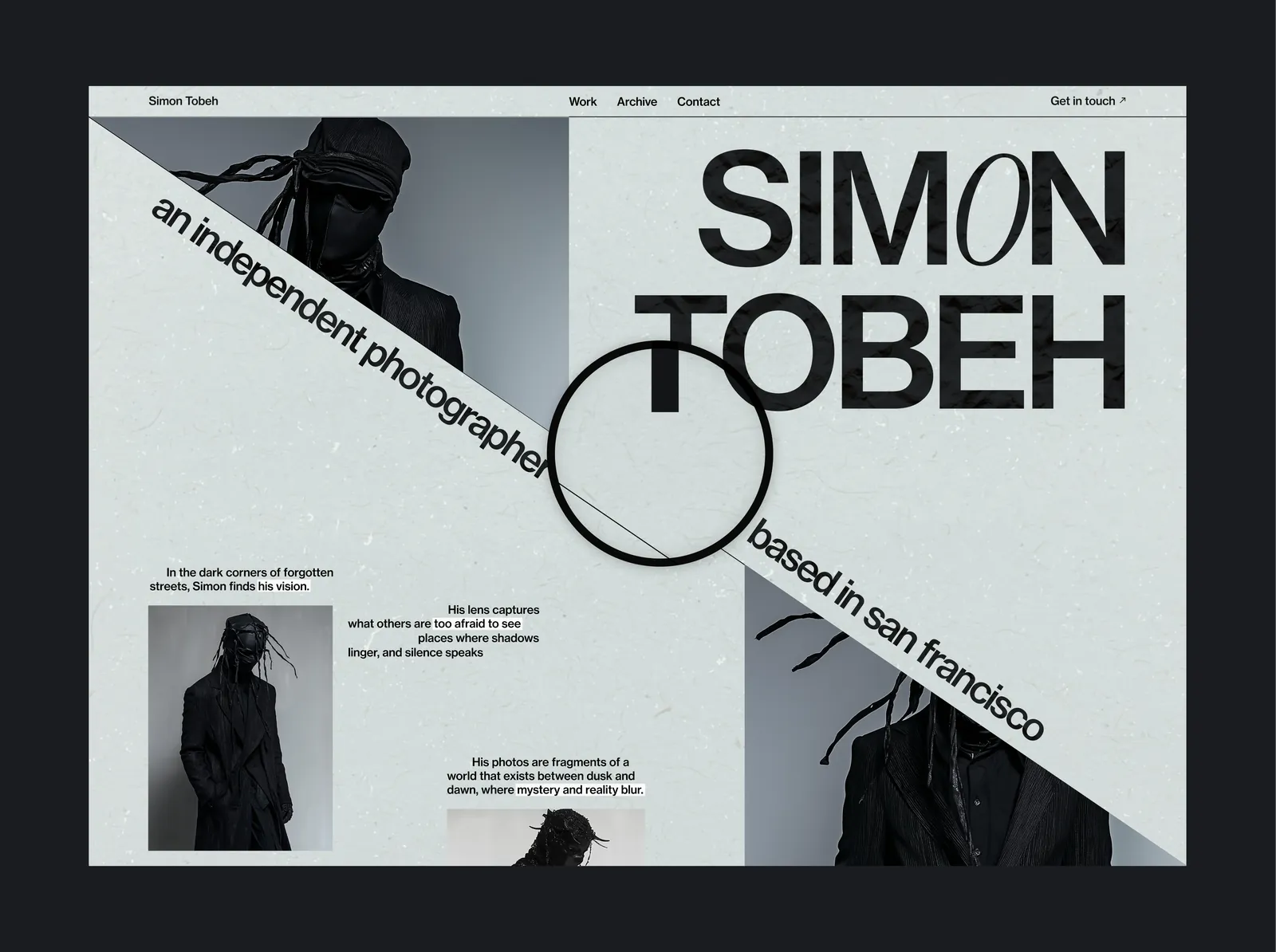
Websites built to sell, not to just look pretty. A UI & UX specialist working as one organism - enterprise standard, founder speed & uniqueness that any AI won't give you.
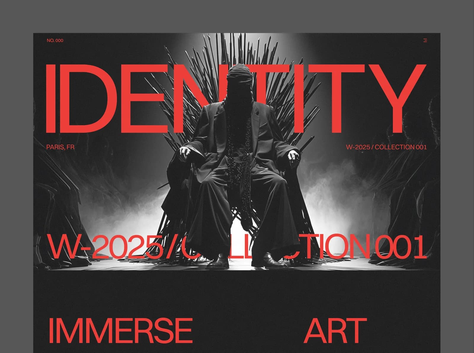
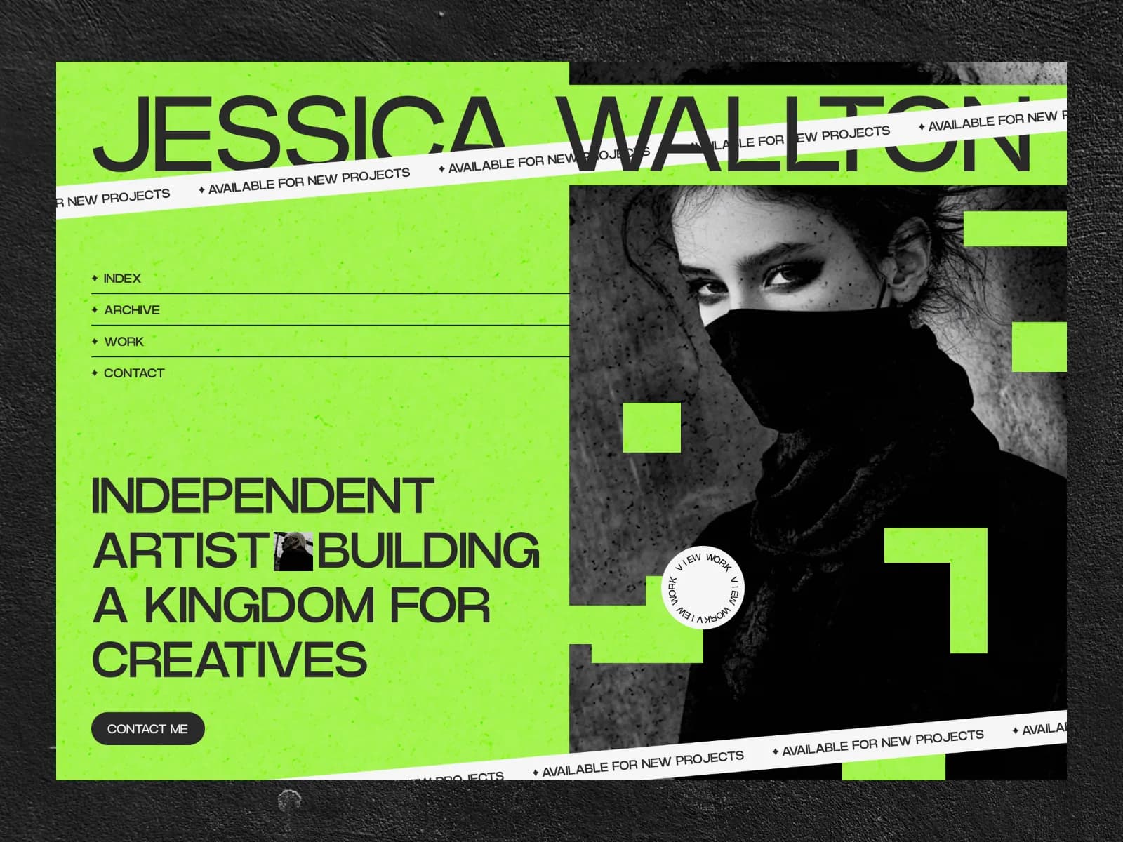
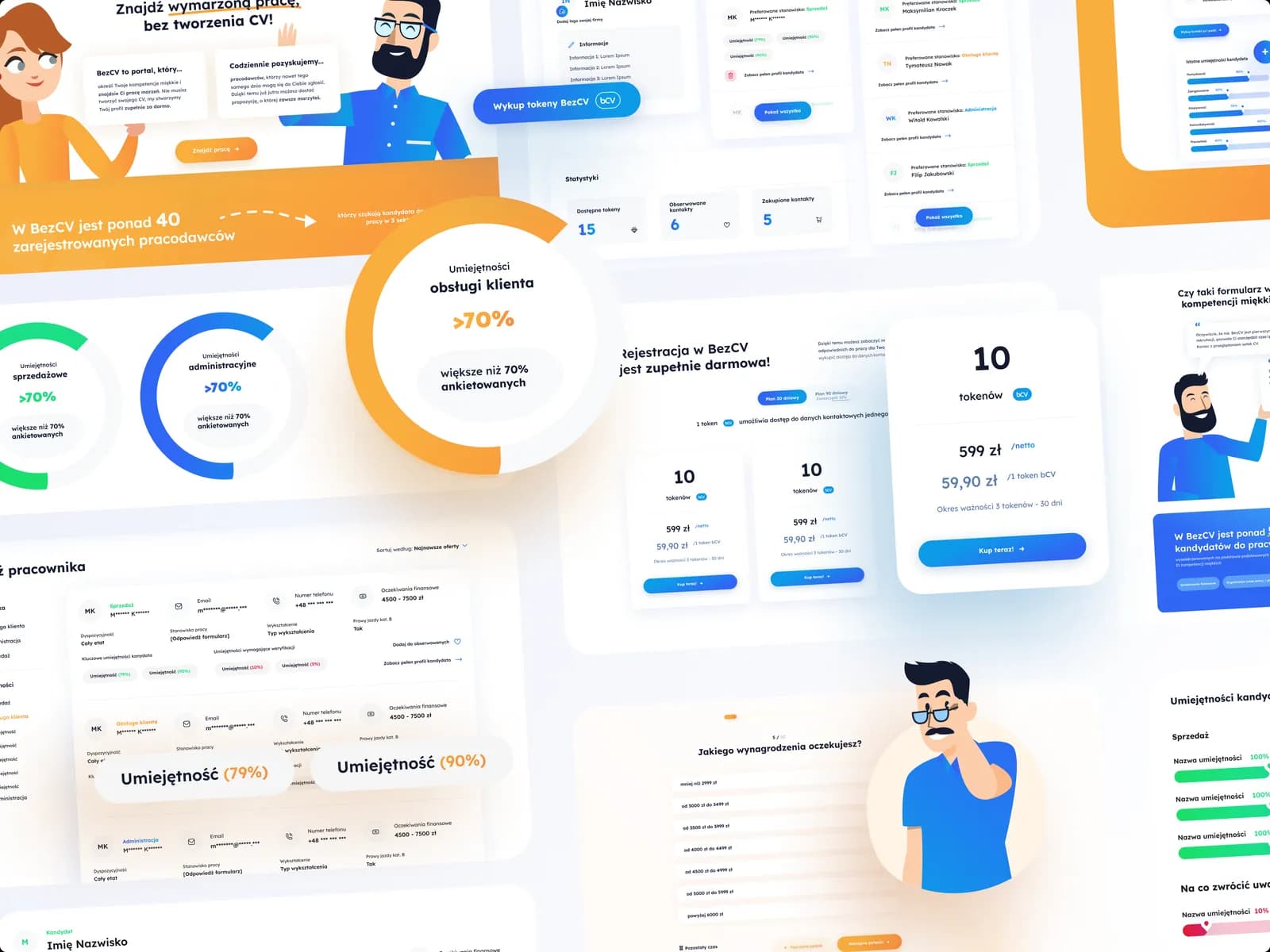
10+
Years of experience
50+
Projects completed
30+
Happy clients
we've worked on projects for
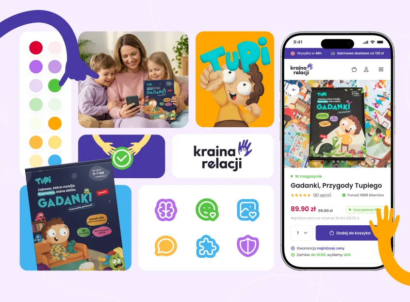
OLX, Lajkonik, Dealz, Pepco, e-Bilet, Zorza Festival, Pernord Ricard and more...
here's what clients say
I was afraid GENSAI would leave us with abstract brand decks and no execution strategy. Instead, they dug deep into our sales calls and churn data - acting more like business strategists than designers. After launch, our sales cycle dropped 30% because we can now explain our value in seconds. The shift in lead quality was instant, and we closed two enterprise deals within thirty days.
I was terrified of paying for another pretty deck with zero real-world execution. But GENSAI moved insanely fast, giving us total strategic clarity in three weeks. Our landing page conversion doubled shortly after, and we recouped our investment before the quarter ended.
I worried an outside team would oversimplify our technical B2B product. What surprised me was GENSAI's ability to turn dense engineering concepts into crisp positioning without losing accuracy. Our team loves the new pitch, and our win rate against competitors jumped 22%.
how we can help
Six things. Built as one system, by the two people who'll actually do the work. Not autogenerate with AI.
One page. One decision. Campaign pages, product launches, paid-traffic destinations. Built around a single conversion, stripped of everything that doesn't serve it. Fast to ship, fast to load, easy to iterate when the numbers tell you something.
how we work
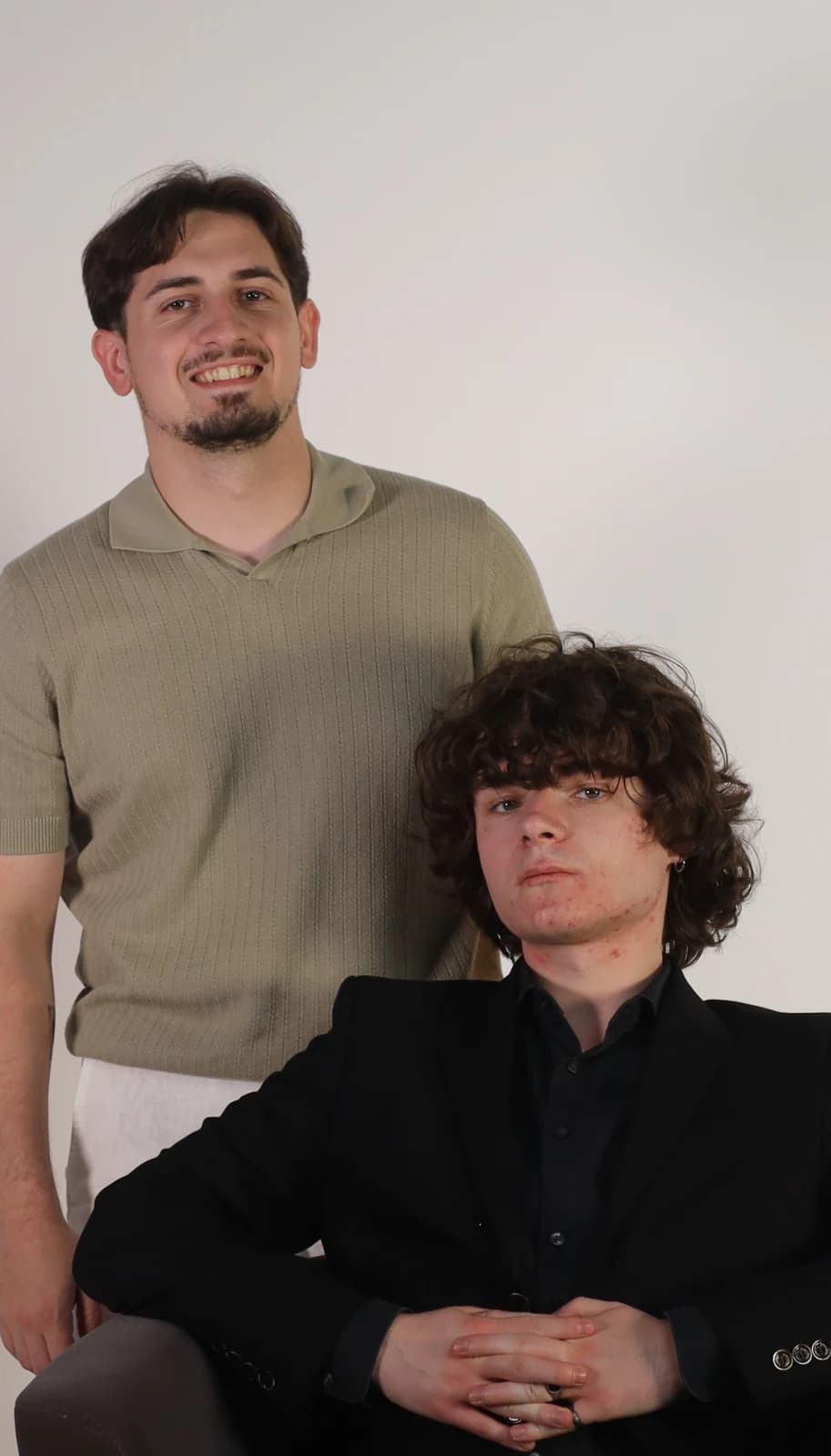
We're two founders who got tired of watching good businesses hide behind generic websites.
brief and strategy
We start with the business, not the moodboard. What are you selling, who's actually buying, what's the one number that would make this project worth it? We'll ask about your sales calls, your churn, the objection you hear every week. By the end of this stage we've agreed on what the site has to do — in plain language, not in adjectives — so that every decision after this has something to be measured against.
brief and strategy
This is where it stops looking like everyone else's. Type, color, layout, and motion designed together as one system — because how a page moves is as much a brand decision as what it says. We work in full fidelity, not in flat mockups, so what you approve is what you'll get. Two or three rounds, tightly scoped, with a reason behind every choice we bring you.
UX architecture
Structure before surface. We map the pages, the hierarchy, and the path a visitor takes from "who are these people" to "book a call" — including the detours they'll try to take and the objections we need to answer before they're asked. You get wireframes and a flow you can actually argue with. Nothing gets decorated until the skeleton holds up on its own.
brief and strategy
The people who designed it are the people who build it, so nothing gets lost in translation and nothing gets quietly simplified to make development easier. Clean, fast, accessible front-end with the motion fully intact, tested across devices before it goes anywhere near live. You get the keys, the documentation, and a walkthrough — plus an optional monthly retainer if you'd rather we keep it sharp than hand it to someone who wasn't there.
We got tired of watching good businesses hide behind generic websites. One of us owns visual direction. The other owns the strategy behind every click. We operate as a single system - which is exactly what your site should be.
about us